Define Your Games Art Style
Game design has moved forward, tools are being developed and everything is starting to come together. Isn´t this the perfect time to start work on the art style of Fireside?
You got it! Today, I would like to take you on a short journey of finding and developing an art style. We will be taking a look at the game jam version of Fireside, some other games and references!
GAME JAM
Last time, when I wrote about "Creating Concept Art", I talked about the rough process of coming up with an idea, declaring a target and shaping the idea to fit the target. This time, I would like to start with taking a look at the game jam version of Fireside.


After the game jam, we received a lot of positive feedback for the art style. It reminded people of Don´t Starve and felt accordingly cozy yet mysterious. The colors which I used established a not too friendly and not too dark mood. They should not distract the viewer but add to the atmosphere of the game. As you can see in the bottom picture (of the two above), colors were originally a bit brighter. We added some post processing in Unity to establish a more desaturated mood. It also adds to the paper aesthetic, which we currently have.
So, we already got some things to take care of and consider while redeveloping the art style:
- Paper aesthetic
- Atmospheric art
- Should not distract
- Should add an element of atmosphere
- Nature and exploration
FINDING NEW REFERENCES
At the game jam, I already used some references but before I started working on the new style, I went looking for some references again! As an artist, you should not be ashamed of using many references. References are helpful to get colors, proportions or specific objects just right and it takes a lot of time to memorize all the tiny details. Normally, I use pinterest to set up a mood board by pinning many different artworks on to a board. You can find some of my boards here.
If you want to find references which fit your vision, try looking at games with similar mechanics, films or comic books with similar stories and art books which might fit the style you are looking for. Be aware that references can also good for finding what you do NOT want your game to look like!
In the following, I will only link a few references... otherwise this post would only consist out of pictures. The following few provide a nice impression and are the main inspirational sources for the new art style.
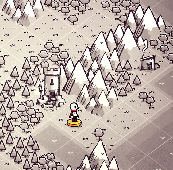
One huge inspiration for Fireside is the art of Dom2D. A black and white aesthetic with clean outlines.
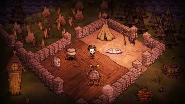
Don´t Starve should not be missing as it has a nice paper-like look and interesting items.
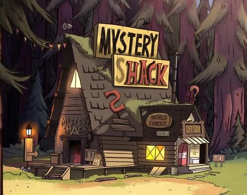
And comics like Gravity Falls have a great color palette.
On the basis of these references, I started working on some first concepts with the following things in mind:
- A noticeable outline is important
- Pastel like colors are good
- Colors can be adjusted later (e.g. post processing in Unity)
- Paper aesthetic is a plus
- Objects should be differentiable based on their purpose
The last point will be truly visible with more drawn assets but let´s get into this!
THE FIRST STEPS
You may now think: "Perfect, now I know where to look for references and how to use them but where do I start with drawing stuff?" Good question! This may depend on your game. You can ask yourself questions like: What is a main element of my game? What does the user see after starting the game? What will be most prominent? Where will the user spend the most time while playing? It is important to get the stuff right, which the user needs to look at the most. In Fireside, we established a great focus on objects at the campsite and on items in your inventory as they will be present for a long time. That´s where I started!
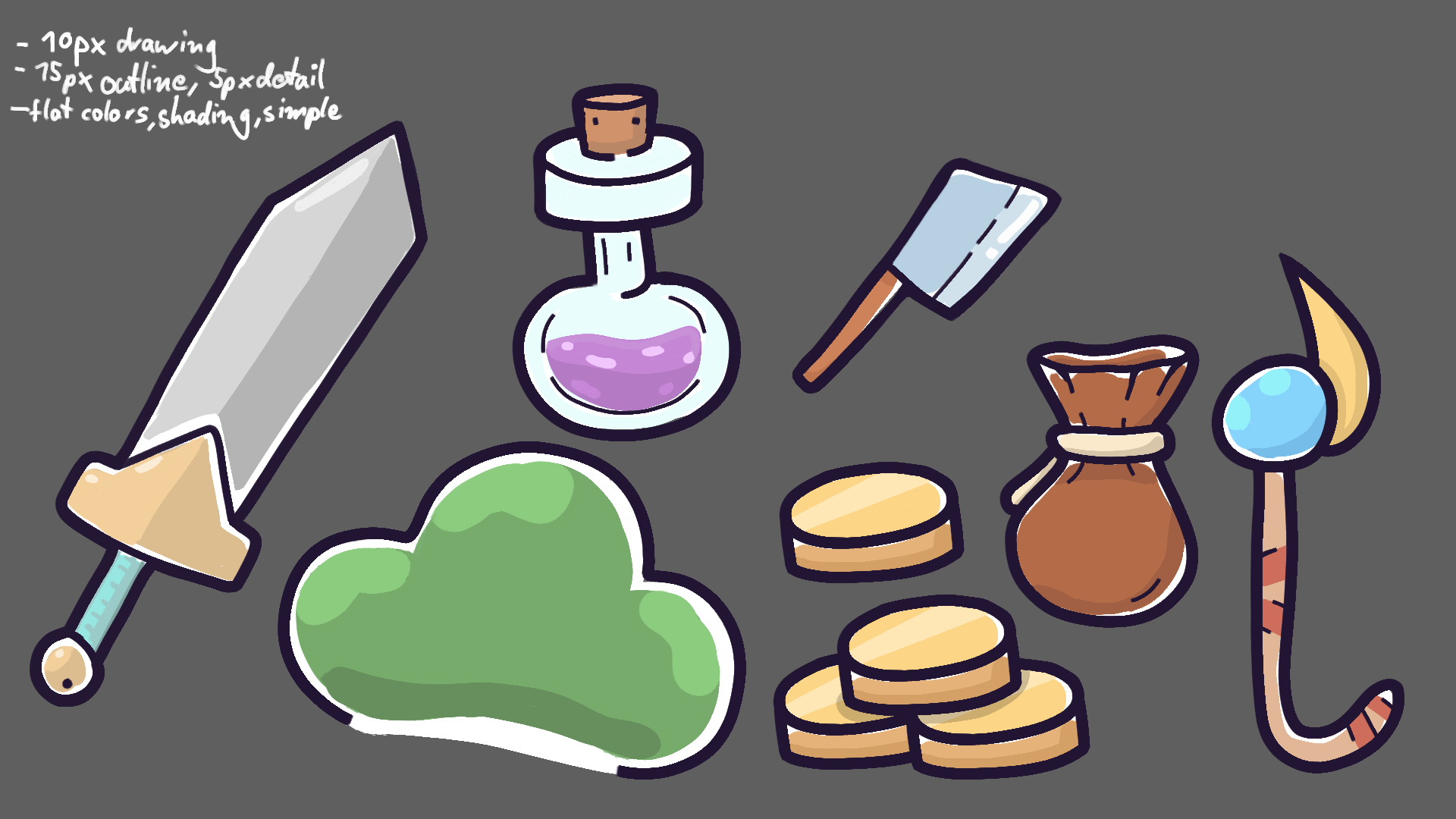
I drew some items, experimented with different line weights, proportions and colors. At the beginning everything felt a bit inconsistent but things started to work well together. I decided to use an outline of 15 px, an inner outline (to differentiate between disconnected and connected parts of objects) of 10 px and some lines for details with 5 px. While working on concept art, the overall canvas which I use is typically quite big with 2000px x 2000px . Let´s take a look at the creation process of a single item:

After I got a feeling for proportions (outline vs. fill), I started working on some concept art for the map screen. Switching between different things like single items and a screen mock-up is really important for me. It helps me to stay creative while working!

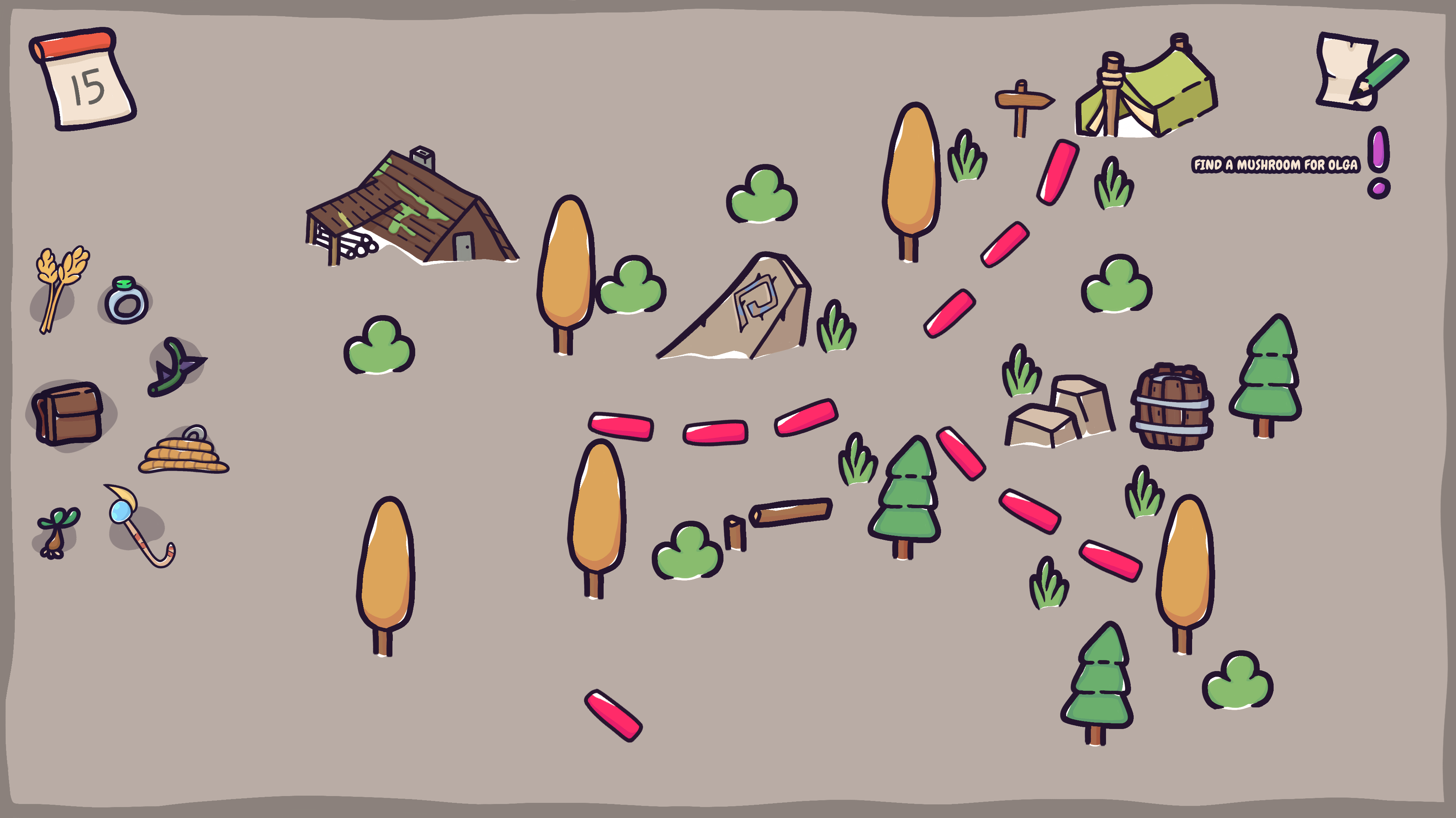
We can already see that the art style changed quite a bit but let´s compare this to an old image.

Currently, the new version lacks a few things:
- Soft vignette
- Pale colors
- More environment stuff like lakes and mountains
- Different opacity for each object
The last point I just mentioned, refers to the trees and their variety in saturation. To achieve this look, I put the color on an extra layer and lower their opacity. As the background of the color is just white, they will look more desaturated. This and the other elements will be added over time and things might still be changing as it is important to be open for changes if they fit the core concept better. If you would like to see how I work on one item in detail, feel free to check out this fancy video of me drawing an item for Fireside! Enjoy!
That´s it for today! If you want to see more WIP Art and other stuff make sure to follow @EmergoE and me (@linusgaertig) on Twitter! Have a great day!
Fireside
A wholesome indie game about the breaks on the journey.
| Status | In development |
| Publisher | |
| Authors | Linus, caphhe, PaulRdy |
| Genre | Adventure, Strategy |
| Tags | 2D, Atmospheric, Fantasy, Hand-drawn, journey, pastel, Singleplayer, solidarity |
| Languages | English |
| Accessibility | One button |
More posts
- Pre Alpha Content PatchMar 13, 2022
- Contacting the PressFeb 16, 2022
- Wishlist Fireside on SteamFeb 01, 2022
- Results of the latest Fireside PlaytestJan 24, 2022
- Finishing the PrototypeOct 20, 2021
- Thank you for playtesting Fireside at Gamescom 2021!Aug 31, 2021
- Fireside Gamescom UpdateAug 23, 2021
- We're going to gamescom!Aug 07, 2021
- The First PlaytestJun 22, 2021

Leave a comment
Log in with itch.io to leave a comment.