The Player´s Notebook - Basic UI Design
As CP and Paul kept you busy with some programming articles in the previous dev logs, we should talk about art again. Today, we are going to make stuff look good and talk about UI design for Fireside!
GETTING STARTED
For many people, UI design is the most exhausting and difficult part of all the art-related things. Good UI is not often worshipped but bad UI design is often complained about. Therefore, our goal is to create a decent and simple UI concept that makes work for us easy while getting good results!
First of all, there are many different parts which need to be designed...
- A main menu
- A pause menu
- The HUD
- Speech bubbles and other tiny things
- Events and other pop-ups
- And more...
Let´s focus on one example for now! I would like to tackle the player´s notebook today. This will serve as an example and the following steps can be applied to other UI designs or your specific UI needs!
CONCEPTUALIZATION
We will only cover this part briefly as we already talked about Creating Concept Art in general! These basics can be applied to UI design as well! However, there are some differences when art does not only need to look pretty but also be useable!
First, we need to write down the functions of the player´s notebook - which things should be displayed, why and when?
Then, we will need to define its style - should it look like the rest of the game, should it be different in some way?
Last but not least, we need to sort it and apply some basic UI design principles - will there be feedback (e.g. animations, sounds, particles) on interactions and how are UI`s arranged?
The player´s notebook should provide information about:
- Current quests
- All locations in the game
- People you met
- Your overall progress
As it should be a notebook, it should also look like a notebook. For that, we are referencing a real-life notebook with pages, bookmarks, scribble, and maybe additional post-it notes. This way, we can keep it simple and let the player form a conceptual model in their head about how the UI works and how it responds.
This is already one UI design principle which we just applied. Conceptual models and referencing existing stuff is important as you won´t need to explain how something works if people already have an idea in mind about how it might work. You will find plenty of different resources for UI design on the web. I can highly recommend you checking out Don Norman and his books "The Design of Everyday Things" and "Emotional Design". These include many design principles for objects in general but they work pretty well for UI too, as both need to be used by humans. If you want to get some quick insights, check out this playlist. When it comes to creating UI, human interaction is really important. You need to ask yourself how humans might interact with your design, which ideas they might come up with, and try to reduce possible misconceptions.
If you are looking for inspiration, check out the Interface In Game website. They’ve got many different references - screenshots and videos - of UI in games!
I created the general concept for the player´s notebook in my head and sketched everything as clean as possible.
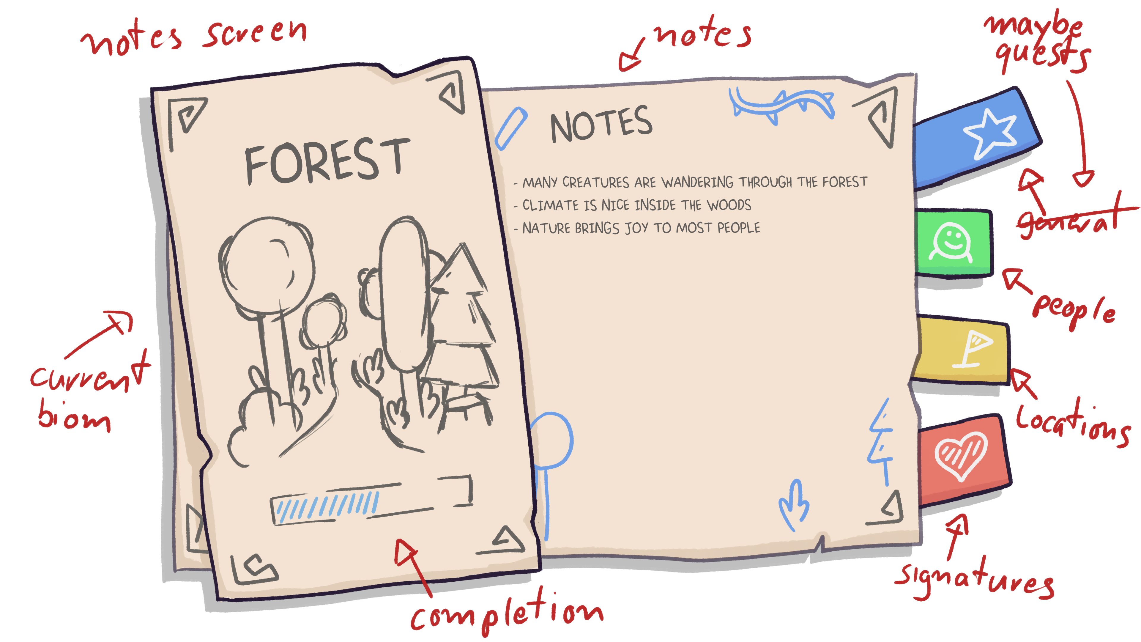
A sketch with notes is always useful as it helps your team to understand your thoughts and come up with ideas for implementing it or adding more functionality.
EXECUTION
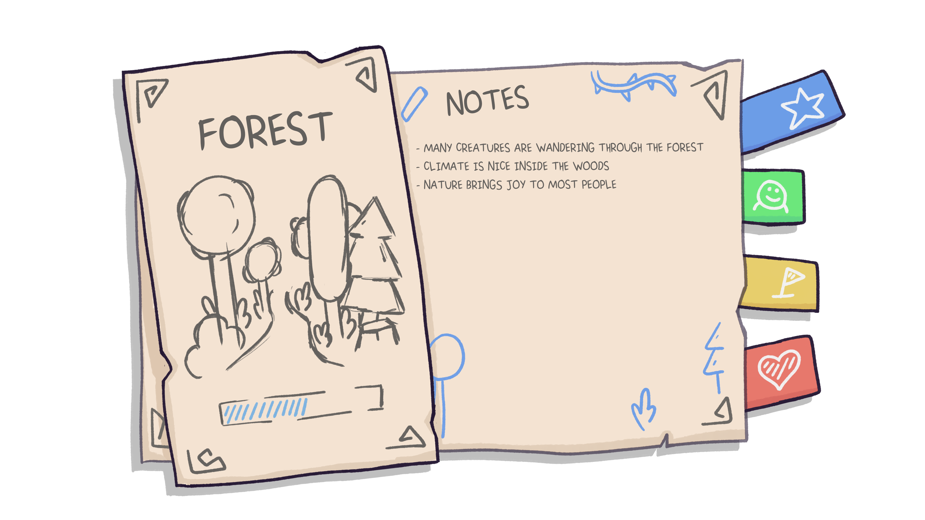
Now it is time to finalize our concepts, draw detailed line art, and add details! Good practice is to draw every element on a single layer. The more layers you`ve got the more flexible you are later on in the process. As my sketch was already quite finalized, I only needed to make sure that all elements are separable from each other.
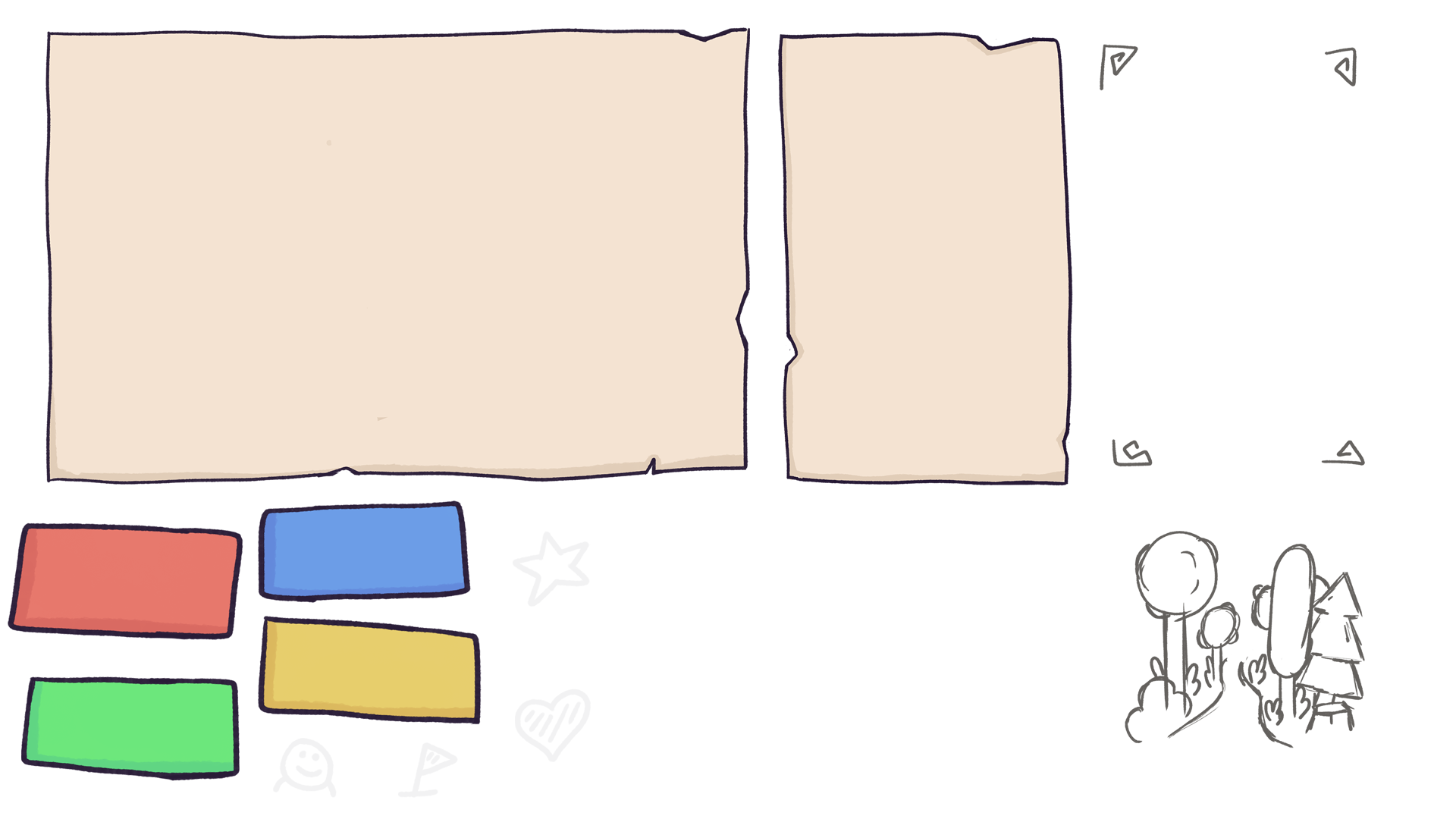
As soon as we have got that, we will need to split it up again into single images which we can later put together in Unity!
IMPLEMENTATION
Now it is time to get everything into Unity and add some animations and life to everything! We can easily import all the files we created earlier into unity and arrange them in a canvas object.
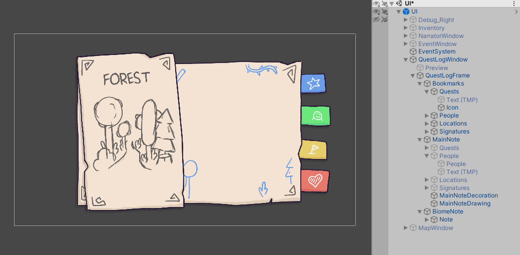
After that, we can add some animations to make it look juicy! We should be aware of the fact that things should feel responsive, as players want feedback when interacting with the UI! In general, we will need an idle-, appear- and hide-animation for everything. For clickable buttons we will need to add some more animations like specific idle- and selected-animations to know which parts should be displayed at which time. The more single animations you have, the better transitions you can make!
Note: Depending on your project, the Unity Animator may not be the most performance efficient way of animating UI. Assets like LeanTweenor DOTween can be a good alternative and offer some functionality via code.
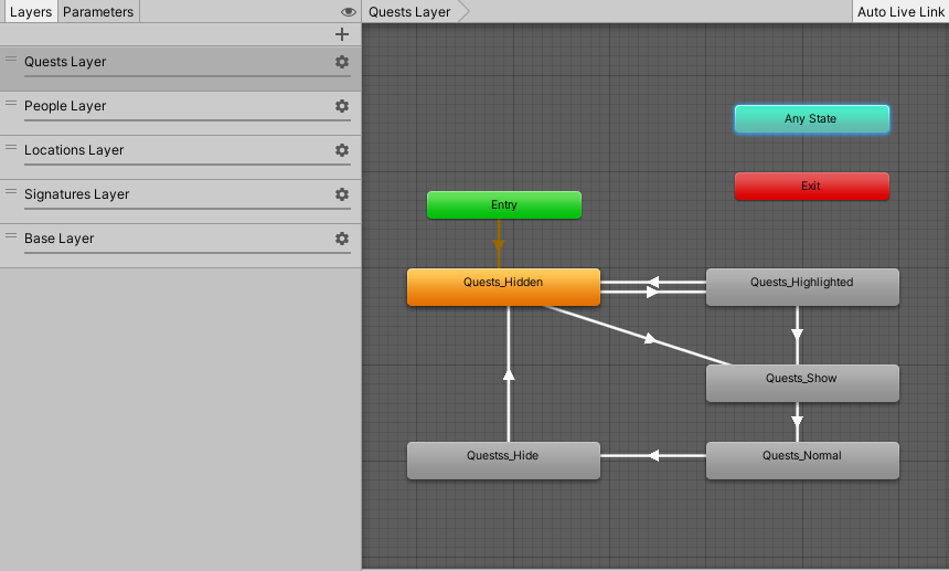
Hook up the animator to your code and... done! Boom. We went from a concept to a fully animated player´s notebook!
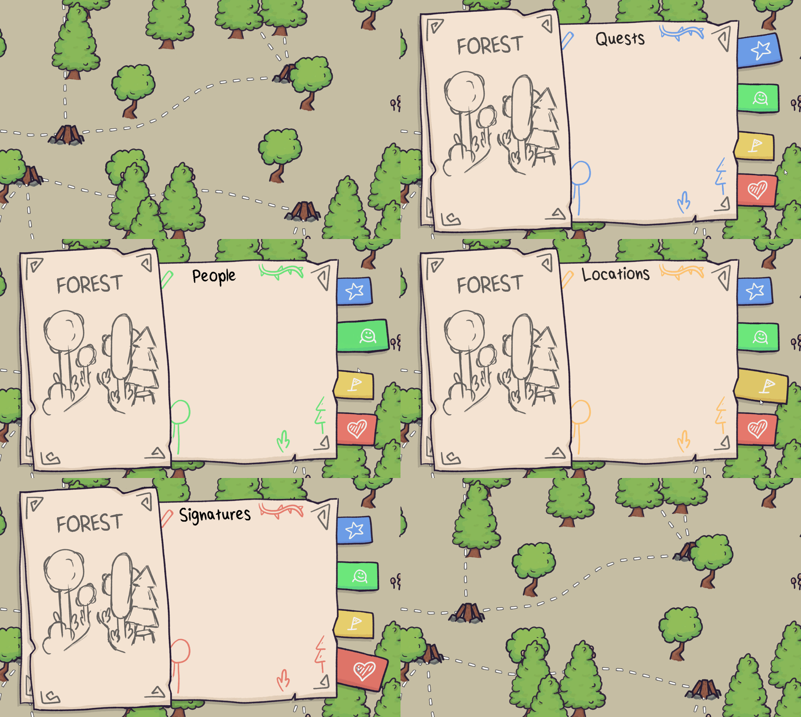
The next step would be to polish it, add the missing graphics, and implement the functionality. But for now, we can be happy with what we got.
If you want to talk more about art or get feedback on some of your work, join our Discord or hit me up on Twitter @linusgaertig!
Fireside
A wholesome indie game about the breaks on the journey.
| Status | In development |
| Publisher | |
| Authors | Linus, caphhe, PaulRdy |
| Genre | Adventure, Strategy |
| Tags | 2D, Atmospheric, Fantasy, Hand-drawn, journey, pastel, Singleplayer, solidarity |
| Languages | English |
| Accessibility | One button |
More posts
- Pre Alpha Content PatchMar 13, 2022
- Contacting the PressFeb 16, 2022
- Wishlist Fireside on SteamFeb 01, 2022
- Results of the latest Fireside PlaytestJan 24, 2022
- Finishing the PrototypeOct 20, 2021
- Thank you for playtesting Fireside at Gamescom 2021!Aug 31, 2021
- Fireside Gamescom UpdateAug 23, 2021
- We're going to gamescom!Aug 07, 2021
- The First PlaytestJun 22, 2021

Comments
Log in with itch.io to leave a comment.
Lookin' very promising guys! Keep it up, yeah!
Thank you, Zwi! We are on it! :)
Thank you ^_^ Slow and steady wins the race :)